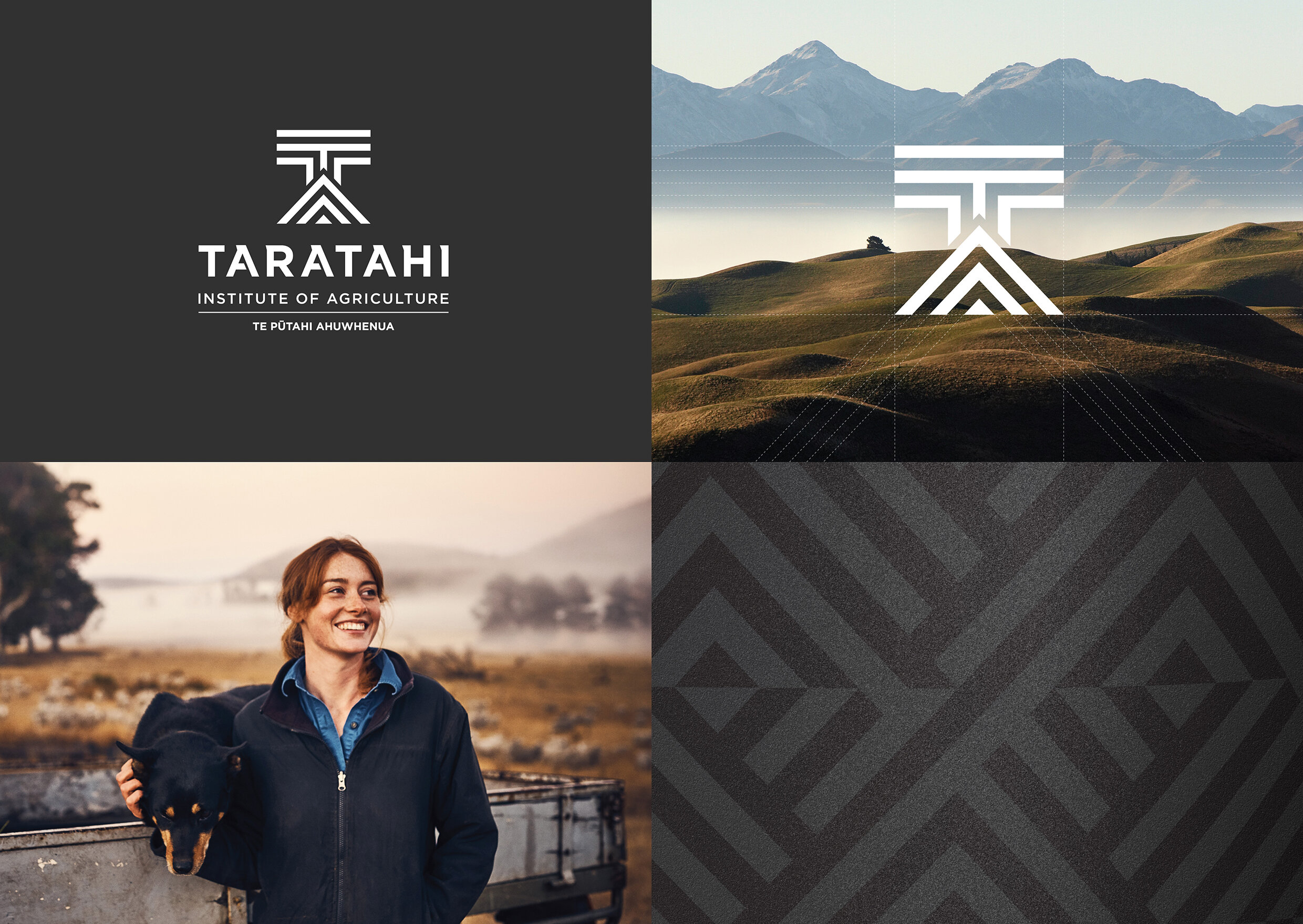
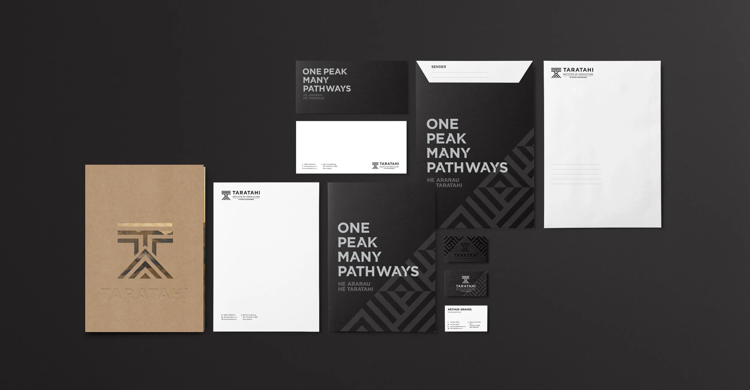
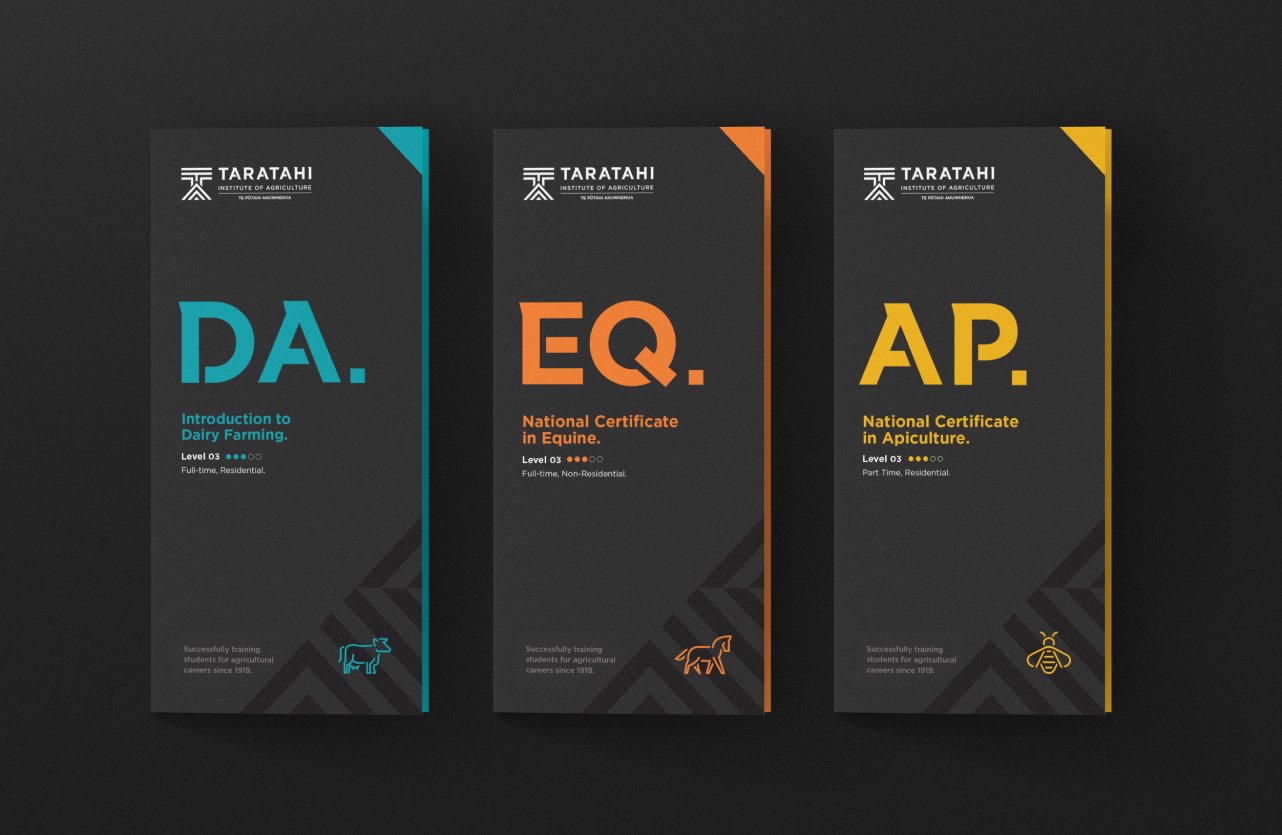
Taratahi Institute of Agriculture wished to become a more modern, attractive option to the youth of Aotearoa and portray the primary industries as a lucrative career path. A rebrand was undertaken that incorporated everything from a new logo, illustration, pattern, colour palette, typography, photography, signage, and communication style.
Completed at Foundry Creative.