Bicycle Junction
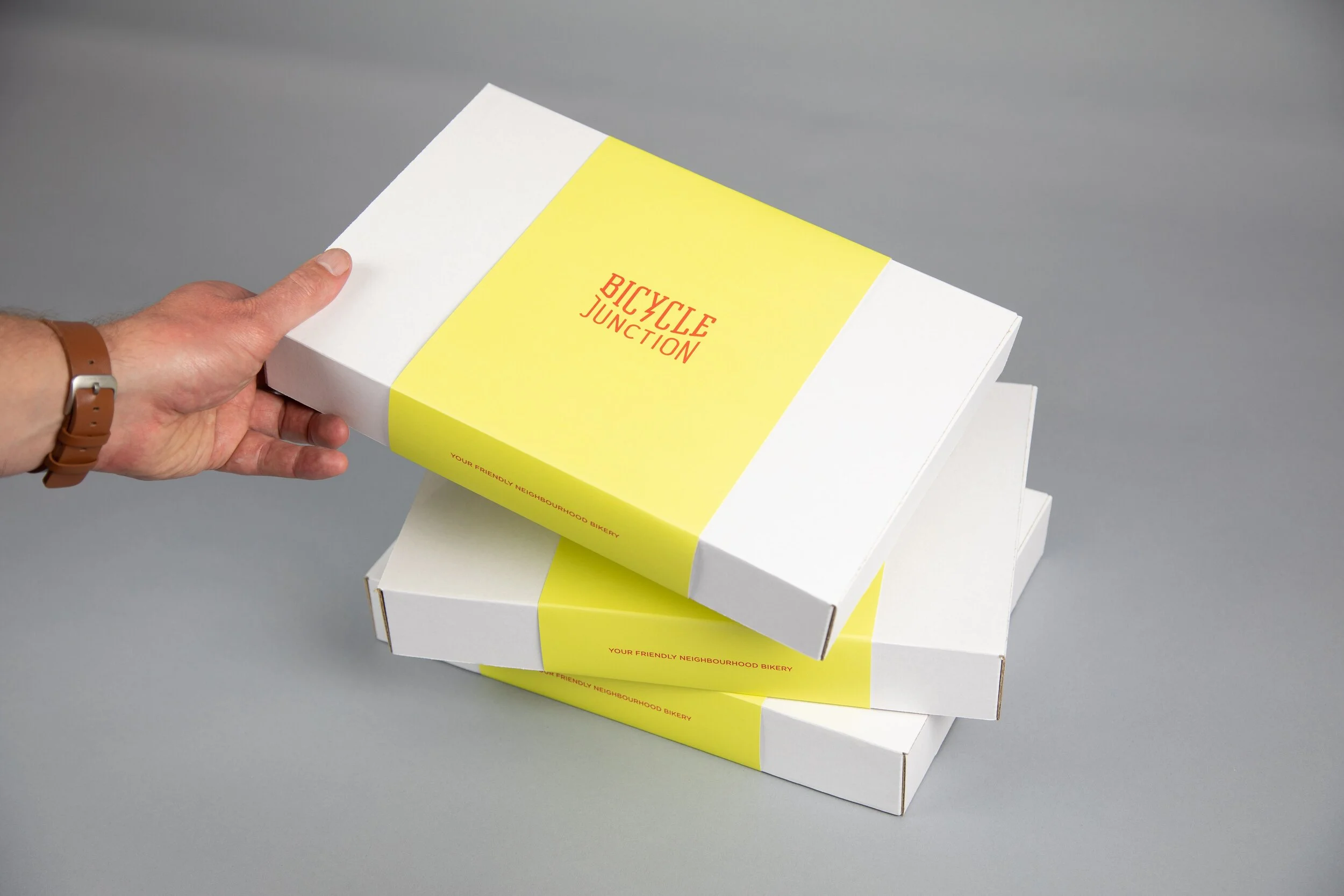
How does a small suburban bike shop with a passionate following, refresh their identity and move to the middle of the CBD, whilst retaining that intimate, community minded feel? We implemented a warm new colour palette, brand language, illustration style and imagery to create a brand and store that hits the mark.
Completed at Foundry Creative.


How.
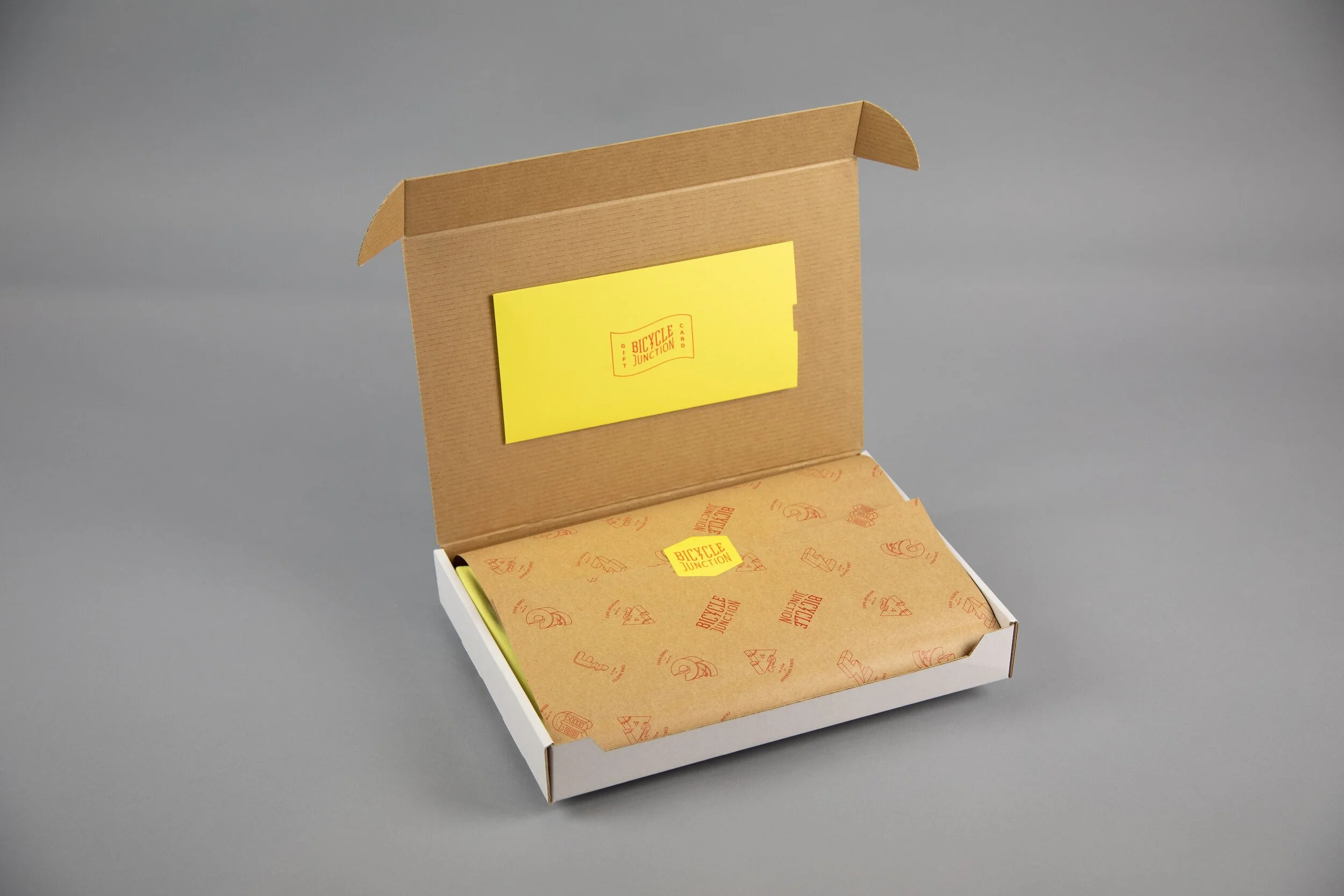
A reduced but energetic colour palette was coupled with engaging illustrations and friendly copy to create a sense of warmth and welcome whilst maintaining a bit of urban ‘cool’.


Custom swing tags were designed that provide the ability to swap out bike specs printed in black and white in-store. To compliment this, a range of stamps were produced to identify which category of bike the tag is attached to i.e. “F is for Folding” etc.